Nike has revealed a collection of brand-new kits that will be worn by 13 different countries at the upcoming 2023 Women’s World Cup.
The array includes fresh home strips for the two host nations: Australia and New Zealand, along with a bold if potentially divisive new home jersey for the United States, who go into the tournament as back-to-back world champions.
There are also new kits for European champions England, Olympic champions Canada and Asian Games champions China, all of whom are set to compete for World Cup glory from July 20 to Aug. 20.
Each individual kit is intended as a celebration of the nation in question, with designers working closely with the federations to include patterns and details inspired by aspects of their own landscape, history and distinct cultural identity.
* All photos via Nike.
– Stream on ESPN+: LaLiga, Bundesliga, more (U.S.)
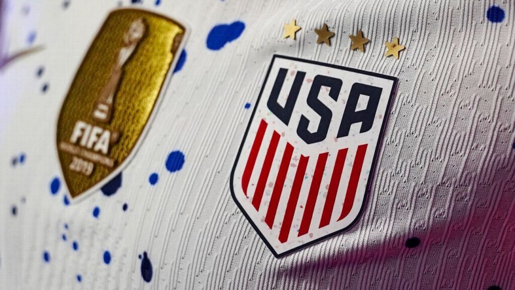
Home: For better or worse, Nike is never shy when it comes to trying something new, with the latest USWNT offering almost certain to divide opinion. The home shirt is predominantly white but features a paint splatter motif inspired by the abstract expressionism art movement that began in 1940s New York — think “action painting,” Jackson Pollock, etc. This is artistic inspiration applied tastefully.
Rating: HIT
Away: The blue away kit is much more subdued with a tonal all-red trim and crest helping to showcase the spiky, lightning bolt graphic print that covers the shirt, shorts and socks. With back-to-back World Cup victories to defend, the USWNT will at least look the part when they arrive Down Under.
Rating: HIT
Home: Both of England’s World Cup kits are informed by the Art Deco movement of the 1920s and particularly the architecture of the old Wembley Stadium. The home shirt is an off-white hue to match the chalk bricks used to clad the old stadium exterior, while the deep blue trim stands as a homage to the 1984 England women’s team, who were the first Lionesses side to take part in a major tournament (the 1984 European Competition, which saw them narrowly lose to Sweden in the final).
Rating: HIT
Away: The away kit is a much less subtle celebration of Art Deco, with a pale blue shirt covered in a lovely all-over geometric pattern which is influenced by the styling of the chalky facade at the old Wembley Stadium. It’s a little bit different and all the better for it.
Rating: HIT
Home: Both of France’s World Cup kits are influenced by Orphism, an abstract art movement that became popular in the 1920s — around the time the first France women’s football teams were beginning to take to the pitch. As well as a subtle fabric weave engineered to look like natural brushstrokes, the home shirt is a much lighter, more lilac, shade than usual, reflecting the colours worn by those teams of yesteryear.
Rating: HIT
Away: The white away shirt features a hand-painted pattern that is intended to recreate the swirling shapes, grids and geometric lines associated with Orphism. As a final flourish, the tricolore on the sleeve cuff is also made up of dripped and dabbled paint, which can also been found flecked across the crest.
Rating: HIT
Home: Brazil’s home shirt sees the knit of the famous yellow fabric imbued with a subtle foliage pattern inspired by the canopies of the Amazon rainforest. It’s simple, effective and doesn’t infringe on the Selecao’s timeless aesthetic.
Rating: HIT
Away: Meanwhile, the lush blue away kit continues the jungle theme with a verdant green leaf pattern printed across the shoulders and down onto the sleeves. Totally tropical.
Rating: HIT
Home: More subdued than many of Nigeria’s recent efforts, the home shirt is a sumptuous shade of green that is lifted above the ordinary by the traditional patterns found on the cuffs and sock ribbing, all inspired by ancient hand-woven textiles.
Rating: HIT, but only just.
Away: Vastly superior to what is essentially just a serviceable home strip, the dusky green away kit is again influenced by traditional prints with the zig-zag graphic pattern containing visual references to the team’s “Super Falcons” nickname — and it’s all set off by the warm coral coloured socks.
Rating: HIT
Home: The Canada home shirt is covered in a laser grid of geometric red lines that form a pattern inspired by the emblematic maple leaf found on the federation crest. It’s like something a Star Wars X-Wing pilot might see through flashing their visor display, and that gets a big thumbs-up from us.
Rating: HIT
Away: Unfortunately, the corresponding away kit isn’t nearly as exciting, with the plain white and red template perhaps most politely described as “traditional.”
Rating: MISS
Home: The co-hosts are to be draped in traditional gold and green with a shirt that features an all-over marbled effect which is somehow supposed to reflect both the Antipodean island’s diverse culture as well as the national team’s progression over time. While the creative spiel is a little overzealous, the kit itself is perfectly decent.
Rating: HIT
Away: Again, the creative jargon asserts that the precise turquoise hue of Australia’s new away kit is representative of a future-facing nation full of vibrancy energy, and forward-thinking. In reality, it’s a fairly plain light blue template kit.
Rating: MISS
Home: China’s home shirt is redolent in the national colours of red and yellow, both found on the flag and deeply rooted in national history and folklore. The woven design on the fabric itself is inspired by the ancient Xiangyun symbol — lucky clouds that are associated with good luck and impending fortune.
Rating: HIT
Away: Again, the away strip is largely straightforward with the traditional Chinese colours flipped and used to create a standard secondary kit option with no real frills to speak of.
Rating: MISS
Home: With funky contrasting neon pink and blue trim on a field of traditional red, the South Korea home shirt is an ode to the nation’s youth and particularly their renowned sense of fashion and quirky style choices. It probably shouldn’t work from a haute couture perspective, but it certainly does.
Rating: HIT
Away: The corresponding away kit is far more tame, with a plain white shirt accented with large, balanced blocks of red and blue on the flank — forming the colours of the national flag. Truth be told it’s a bit bland, especially when compared to the home strip.
Rating: MISS
Home: Another perfunctory design sees Portugal bestowed with a traditional, highly subdued reinterpreting of their red and green national colours, as found on the flag. The kit is supposedly inspired by modern art, fashion, maritime history and traditional craftsmanship, though none are immediately evident.
Rating: MISS
Away: However, things are ratcheted up a notch or two when it comes to the away kit. This features a stunning cracked, speckled pattern inspired by “calcada Portuguesa” (Portuguese pavement) which is used to decorate pedestrian areas in towns and cities all over the country.
Rating: HIT
Home: There is nothing remarkable about either of Norway’s kits, with both designs mostly interchangeable with many of the Scandinavian nation’s former offerings. The home shirt is a simple red design with trim made up of the rest of the colours found on the flag, as per usual.
Rating: MISS
Away: As you might expect, the away shirt is a standard flip of the aforementioned colours with the white replacing the red as the main event with no additional visual flourish of any kind.
Rating: MISS
Home: No prizes for guessing that Netherlands will play in orange at the World Cup, with the latest iteration of the national colours featuring a strange two-tone contrast in the weft of the material that creates an unappealing waxy sheen.
Rating: MISS
Away: As is common, the Dutch away kit displays the colours of the flag, though the red and white are confined to the trim while the blue forms a dark, clunky, indistinct mottle print that doesn’t really move the soul in any way.
Rating: MISS
Home: Alas, New Zealand have been presented with a new kit that isn’t befitting of co-hosts, with the traditional black jersey covered in a scabby fern print that makes it look as though it’s been trodden on by people with white paint all over their boots.
Rating: MISS
Away: The away kit is at least a lot cleaner, with the ice white shirt accented with flashes of vibrant blue inspired by the uniform worn by the New Zealand squad that qualified for the 1991 World Cup. It’s hardly a classic, but it’s more visually appealing than the disastrous home strip.
Rating: MISS